Monday, October 24, 2005

Drawing with children

LAURA

Age: 7
Drawing:

- Self-portrait
- Dog

Laura started off her drawing by asking her mother if she could use a mirror to do a self-portrait. Unfortunately, there weren’t any mirrors available. Laura distanced herself from drawing herself at the beginning by helping her younger brother, Jack, in doing his drawing. When Laura got focused on doing her drawing she asked the most classic young child colouring quote, “Which one of your felts is skin colour?”. I quizzed her by asking her, “do you mean the colour of my skin, or your skin?”. When she discovered the felt that represented her skin tone colour, I said that her felt that she chose was the colour peach as stated on the side of the felt. For the most part, Laura drew the outline of herself in pencil, and then coloured in the rest. She was very concerned about her fashion and asked me several times what colour shoes, dress, jacket she should wear. She then made an effort to draw herself wearing ‘Converse’ brand shoes. The last thing she drew was her face. She chose not to draw a nose because she didn’t like to draw noses. The last thing she added to herself was brown streaks in her hair (a).

Laura also decided to draw her favourite animal; a doggy (b). Being that it took a very short amount of time (three minutes) for her to draw her dog, I would assume that she had mastered the technique.


(a)
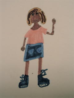
(b)

JACK

Age: 5
Drawing:

- Self-portrait
- Manni the Wooly Mammoth

When Jack was given the instructions to draw a picture of himself, he was quick to draw with the help of his older sister, Laura, a picture of a smiling boy (a). This did not take long.

However, immediately after finishing his self-portrait he grabbed his favourite toy, Manni, the Wooly Mammoth, and got Manni to draw a self-portrait of himself (b). Jack placed a felt in Manni’s trunk, and spoke out the directions as he helped Manni draw a self- portrait. Jack said: “first, you need two J’s for the tusks. Then you need a trunk for a nose. Then you draw four feet”. In order to draw an accurate size of Manni, Jack placed Manni on a piece of paper and drew a circle around him. To give the effect of fur, Jack drew scribbles (c).


(a)
(b)
(c)

Sunday, October 16, 2005

Goopy Papier Mache

Papier Mache - What a concept! Read while you have fun using your reading substance for art!

INGREDIENTS: water, Poly stick fast wallpaper paste

INSTRUCTIONS: mix water and Poly stick fast wallpaper paste together. Le voila! Amazingly simple!

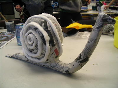
When given a choice as to what creature I could bring alive, I was instantly drawn to a slide we had seen of a papier mache snail. I have always been fascinated by these bizarre insects. As a child I would collect as many as I could from the garden and race them across our family picnic table. My mom had no complaints. I was ridding the yard of a pest, and I was wasting hours of my time watching snails crawl across a long surface.


I decided to do my papier mache snail in two parts: the shell and the body. The body consists of a coat hanger folded in two to allow for more durability. In hindsight I would have shaped the coat hanger into more of an 'S' shape to allow for the snail to be more sturdy. The shell consisted of wrapping numerous amounts of newspapers into a flat ball and taped tight. I then papier mached individually both segments and then placed the shell on top of the body. To 'glue' the shell to the body I placed strips of papier mache between the segments. In order to give the snail's shell some life I used toilet paper to place a spiral ring around the shell.

Once again my FAME classmates have created amazingly creative pieces of art:
Chris has created a puppet head. What really got me interested in his design was his fantastic use of colours. He used one colour (blue) to paint his whole head. He then added bit of black to the blue to darken the shaded areas. Using his original base colour he added white to lighten the areas on top. It's hard not to get caught in this creature's eerie gaze (I'm referring to the puppet head!).


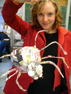
Courtney made a lively spider. Everytime that I look at it I feel like it's going to jump off the table and start tap dancing. It's a great Halloween decoration and when it's painted black it will creep any kid out!


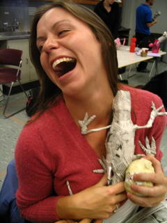
Unfortunately, the creator of this amphibian (Mike) did not want to be photographed, but Amber shows how realistic a papier mache creature can be!


In order to make her beautiful butterfly fly away Nancy used tissue paper dipped in (????GLUE LIKE SUBSTANCE??? what is this called??) and then layered it over the wire frame wings. Really cool!


Steve demonstrates in his Salmon papier mache how simplicity can lead to an amazing piece of art. Steve created his Salmon by keeping to one shape (oval), and then adding fins.


Stu made a Roald Dahl "B.F.G." puppet. What makes Stu's puppet interesting is the fact that she sewed and glued his body together as pieces of clothing.


Lynn and Jen made green creature hermit like puppets. It was interesting to watch their puppets develop as they sat next to each other in class for their puppets began to share many commonalities with each other.


Kav made an awesome Miss Piggy. I really enjoyed the fact that she used yellow yarn to make the pig's hair.


Greg was very proud of his Saturn display. His rocking planet demonstrates how we can use art in almost any subject to teach a topic. How cool would it have been to have had a display of planets made by the students out of of papier mache in one's classroom?


This photo demonstrates how papier mache can be used to make very large puppets. This papier mache head was in the back of the classroom, but it is a little bit larger than a basketball. The artist started off papier macheing a balloon, and then adding on sepearte segments.

Painting a la Actor

Today when we showed up in class we were greeted with postcards of paintings of people that were placed on the tables in front of our seats. In the middle of the table was a postcard of a painting of an object. Our chore was to create as a table a mini skit combining the characteristics of our people and the random object. This task fulfilled two of the requirements set by the BC curriculum. Firstly, it allows for students to perceive and respond to the art. For example, individually we assessed what we thought were the characteristics of the person in the postcard and developed a persona for them. Secondly, the activity allows for the students to communicate their response through art. In this case the artform was that of drama. The results were hilarious. Not only did 80% of the groups include a scene of a mother (usually played by a male) breastfeeding, but each group had a completely different sketch altogether.

Our group created a skit called:
"Death to Llama!"

Sue Anne played the Madonna holding her whiny child.


Laura played the mean French man, Andre, who would not allow for the child to ride the llama.


I played Susie Marie, the ignorant woman, who thought it was cruel that Andre would not let the child ride the llama.


Courtney played the majestic ballerina who assumed that she was getting a long round of applause.


And Christine played the savage llama killing Inuit who decided to end all misery by causing misery.

Sunday, October 09, 2005

Art reflection #3

WORKING WITH CLAY:

Today I'm feeling healthier and can finally actually get into my art activities. Today was also the first day that we got to use the art room at UBC. The class focused on clay activities that can be done with students:

#1. Build a Habitation
Children start the class off discussing different styles of habitations. They are then shown photos of habitations from all around the world. They look at pictures of houses, bungalows, huts, mansions, pyramids, castles, etc. Then they are shown photos of houses that have 'art' as a focus. They look at pictures of houses made out of glass bottles; houses made in the shape of an elephant; houses that are made out of plastic, etc.


Then the children are given an opportunity to build their own habitations out of clay. At the same time a group of children begin building an island out of paper mache and clay. Afterwards they glue their habitations to the island to the area that best suits the needs of their habitation.

Then we discussed the different methods of working with clay. We were shown the proper techniques in properly gluing two slabs of clay together without them falling apart in the kiln. We made the bonding glue of SKIP, which consists of a mixture of water and a bit of clay. When SLIP is put between slabs of clay it keeps it together and smooth. I found that SLIP was great to use as an outside coat to fill in the cracks.


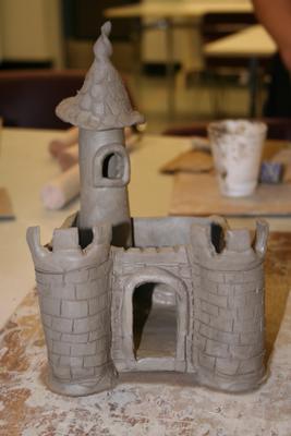
Then we were given an opportunity to build our own habitation. I chose to build castle as it has always been an interest of mine to actually live in one someday! It started off pretty tame, but then I got inspired when I was speaking with someone about the story of "Oobleck" by Dr. Seuss. In the book, the king runs up a very tall spire with a weird Dr. Seussian roof. On my castle In included this tall spire, and even included the window that he leans out to see his whole kingdom covered in oobleck.

Art Reflection #2

Introducing Drawing to Children

If last week was bad, this week was killer tiring. This class was once again very relaxing and informative, unfortunately I was hacking and sniffling, and just wanted to go home. However, I did get stuff done, and we took a very cool walk to the UBC Botanical Gardens. The drawing exercises that we attempted today are used for introducing children and adults to drawing.

1. The first exercise was to find an object, turn away and draw it from MEMORY:
(Unfornuately, I have misplaced this drawing of a leaf :)
I found this exercise to be the most frustrating as I just wanted to always turn around and take a quick peek. Half way through the drawing exercise I felt like giving up, because I knew that I could draw it better when I was using observation. Eventually I found myself speeding the exercise along, and thus moved onto the next exercise.

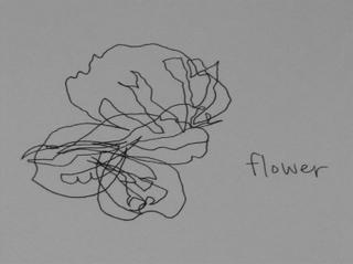
2. The Second exercise was to do a BLIND CONTOUR DRAWING:

I loved this exercise. The exercise requires that the artist keeps the pencil to the paper, and his/her eyes on the object. They are never allowed to look at their paper until the exercise is over. In my eyes, it made things that were beautiful even more beautiful. The object that I chose was that of a pink flower. It was a beautiful flower, and when I saw the outcome of my drawing I thought at first "man, I really screwed that up!". Yet, as soon as the words entered my mind a passerby said "wow, that is a really nice interpretation!". (me blushing)
What I also found interesting is that when doing the exercise I had a tremendous amount of confidence that what I was doing was going to look very accurate. I am sure that with practice it can be possible to get more accurate, but for now it has made me appreciate more the combination of my sense working together. Take too much for granted.

3. The third exercise was to TRACE an object:

This I found was the most simple of the exercises. It required that you place an object underneath a clear overhead sheet, and trace it. I chose a leaf with many veins and chunks missing out of its sides. This exercise I also found that I had the most control. What I also found neat was that really start to notice the amount of detail and patterns in nature. Very cool.

4. The fourth exercise was a MINI TRACE of an object:

This exercise is the same as number three except that the overhead sheet is extremely small (size of a photo slide). This exercise was simple and addictive. I did about three of these in five minutes. Once again, it's amazing how much detail and weird patterns that are in nature.

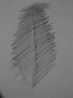
5. The fifth exercise was to rub pencil over an object to get TEXTURE:

This was the last exercise, and by this time my head was pounding, and my nose was constantly running, and so I admittedly rushed this exercise. However, it does show texture that is found within a leaf. Some of the other people in the classroom did some excellent texture rubbing on rock surfaces and wood surfaces. The exercise made me think how our ancestors might have used this technique to do an early method of 'photocopying'.

Art Reflection #1

The Basic Elements of Drawing

Today was my first day of my Art320 class. Unfortunatley, it was the last day of a series of many long days so I was exhausted and wasn't fully participating at 100%. However, it was a very simple and basic class. The simplicity is what I found interesting, because I never really stop to think of the basic elements that make up my drawings and photography. In the class we participated in an activity of taking photographs that showed the main elements of:

LINES

SHAPE

FORM

COLOUR

TEXTURE

SPACE


and the principles of:

REPITITION/PATTERN

BALANCE

EMPHASIS

CONTRAST


Overall, it was a very relaxing class and I look forward for more to come.

mitrocells


Saturday, October 08, 2005

birds